What are flags? Well, at their simplest, they’re pieces of fabric that can represent places, groups of people, organizations, and ideas—among many other things.
They’re distinctive colours and patterns that have been used to differentiate groups since time immemorial.
There are some very distinctive flags to be seen around the world—like the Canadian flag, described formally as a vertical triband of red and white, with a red maple leaf that is far too complicated to be drawn freehand. The leaf has long been a symbol of both Quebec and Ontario, while the previous flag was a British red ensign defaced with a Canadian coat of arms, perhaps explaining Canada’s continued relationship with red.
There’s also the flag of the European Union—a solid blue field with 12 gold stars formed into a circle, representing the nations of Europe come together under an organization that would prevent the continent descending into conflict like the Second World War ever again by binding them ever closer (or at least that’s the idea).
Flags don’t have to be national or supranational, they can also be subnational and even subprovincial—bringing us to the flag of the Resort Municipality of Whistler (RMOW).
And what a flag it is. Did you know that what is usually understood to be the logo of the RMOW is actually also the flag of the community by extension?
A white field, with a logo made up of a green, stylized W (for Whistler, how twee), and a stylized blue mountain, both mushed together to form a bigger mountain, atop bold, blue, caps-locked type spelling out W H I S T L E R.
Boring, low energy, sad. It’s perfectly respectable and distinctive as a logo, but as a flag? Nah.
White, blue and green are good colours to work with for this part of the world—white for the snow, green for the trees, and blue for the beautiful blue-bird days we get.
The sneaky W in the logo works, too (did you even realize it was there? Was a first for me when I stared at it for too long last week at a council meeting).
But spelling out W H I S T L E R? No, not good. It breaks one of the five principles of vexillology (the study of flags), in that the flag has lettering.
Of the other four principles of vexillology, the Whistler flag also runs afoul of a need for distinctiveness.
It meets the other three rules, however (simple enough for a child to draw from memory; uses distinctive imagery; and uses two or three basic colours).
Buuut, the white background also makes it hard to see, and the proportions are off. So, I think Whistler can do way better. There are some amazing city flags out there—like Chicago, Washington D.C., Toronto, all the flags in Japan, and more. Whistler might be small-fry compared to them, but looking elsewhere in B.C. there are some very distinctive, colourful flags full of punchy, relevant motifs, whereas here in Whistler we have a logo on a bedsheet.
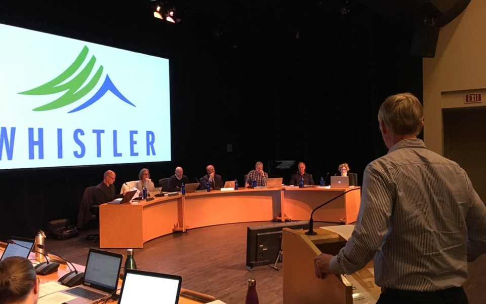
I write all this because I was delighted to read a letter to the RMOW presented to council at the Dec. 5 meeting, in which a student from Salmon Arm wrote in to very kindly throw shade on the RMOW flag in much the same way. Leo Anderson, who wrote the letter, suggested simply removing the W H I S T L E R as part of his studies into design. It was pleasing to see council vote to receive and refer the letter to staff rather than just ignore it. It certainly doesn’t mean anything will change, but the good-natured acceptance of a well-intentioned observation, to me at least, opens the door to conversation about how much the RMOW flag actually sucks.


